In what has now become weeks of internet apathy I've come to realise something as I occasionally turn back to Feedly to browse through all of the blogs I read: I've gotten so tired of all the beautifully staged and decorated homes I tend to see in the various articles on the various blogs that I follow. It's not that they aren't lovely or well put-together or enviably executed...they've just all started to look the same. Know what I mean? If not, I'll endeavour to be a bit more specific.
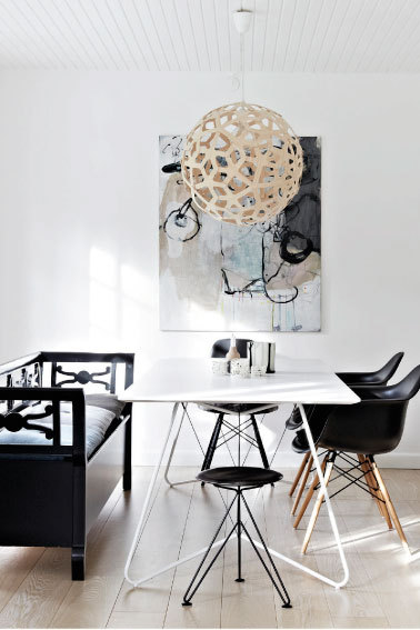
All white walls.
Shoot me. Shoot me now if I have to look at another house with its boring attempt to get that neat, clean, bright, minimalist Scandinavian look by refusing to add colour to the walls. Sure, it looks nice on a beautiful sunny day, or in those overblown white-balanced photos, but white
also shows a lot of dirt. Every fingerprint, every smudge, every spot where you didn't realise that the black cardstock bats you hung for your son's first birthday party would leave nasty marks on your walls. Okay, so maybe I'm just fed up with my own white walls to some extent, but I'm really tired of nearly every house I look at looking like these:
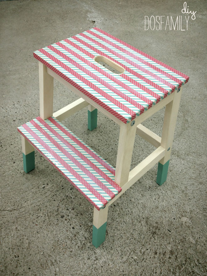
Dip-dyed and partially-painted furniture.
I get it: this was a thing...and apparently still is in a small, waning sort of way. But it's officially (in my not so very humble opinion) stopped looking cutting edge or chic or
new to paint most of a chair but leave the legs unfinished. Or to have a stool that's bright yellow...until you get to the last 6" of the legs. I get that a bit of contrast is a fun thing; that sometimes you want a little of the natural grain and colour of a wood piece of furniture to show through...but let's find a new way to do that. Find fun stains, stencil the stains or paint in fun, simple patterns uniformly over the whole object, paint the whole piece and use an unfinished wood accent piece somewhere else, but for the love of DIY
get over the dip-dye trend. Now. Thank you.
Black and white.
Yes: it's bold, it's graphic, it's striking...it's bloody well gotten boring now. Black and white striped rugs. All black-and-white rooms. Black and white geometric patterned pillows. Black and white art work in black frames on white walls. I'm tired of it. It's stopped looking clean and now just looks soulless. (She says, sitting beneath a giant b&w print her husband made, hanging in a black frame on a white wall. But you've seen my house: I love me some colour.) Don't get me wrong: I could love some black-and-white square floor tiles in a kitchen as much as the next girl, but some of this has just gotten ridiculous. Like MJ said, you can still have a stylish room, it don't matter if it's black and white...or, well, something like that.
So what do I want to see more of?


No comments:
Post a Comment